This is a catalogue featuring a few of the most recent logos I have done. Phone Numbers have been removed for this use.
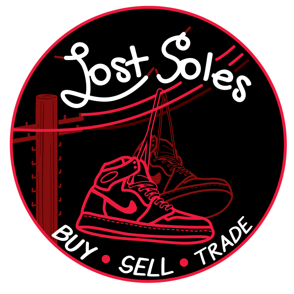
Lost Soles is an up and coming shoe shop with a focus on the Buy, Sell, Trade market of shoes. The symbolism of the shoes on a telephone wire represent whenever somebody has passed. This plays into the pun of Lost Soles as “Soles” is pronounced the same as “Souls”, being those that were lost. The double meaning is that somehow the shoes made their way to the shop and are in need of a new home. The contrast of the bright red and black are what make this logo shine. There is a clear hierarchy present.
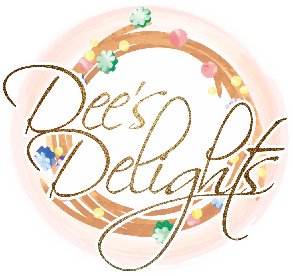
Dee’s Delights is a local cookie decorating shop and they wanted an elegant watercolor logo featuring their signature wreath design featured on their cookies. This was a difficult design to blend the water color effect with a vector based design that is necessary with logos in the digital age we are in today. Vector logos can be resized to any scale without losing quality opposed to raster based images. That being said this was a successful piece due to the watercolor texture being present and believable without being tied down to a certain scale. The opaque background further solidifies the watercolor idea and the shape of the logo while also providing more of the water color context to the image. It acts as a catalyst to soften those harder vector based edges.
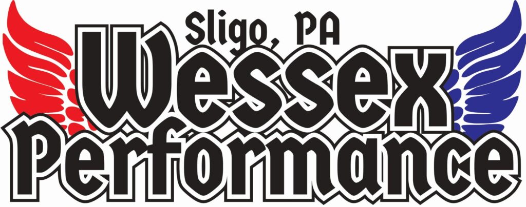
Wessex Performance wanted a logo that brought Norse imagery and the American spirit together. The symbol of the wings and shield shape coupled with the geometric chiseled looking font. The colors also clearly represent the the colors of the country. The proportional hierarchy and contrast between the lighter colors with soft shapes and complete black and sharp lettering pulls your focus to the name of the business first. The overall shape of the image brings everything together into the center and directs the eyes toward the other important info which is the means of contact by phone.
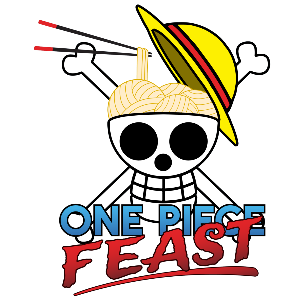
This logo was made for a podcast and required adapting a source material into a personalized food related logo. The podcast is about an animated show by the name of One Piece, which prominently features various versions of a Jolly Roger, or flag with the skull and crossbones. This particular logo takes the main pirate crew “The Straw Hat Pirates” and incorporate a food theme into it. The skull was converted into a cooking pot for noodle balls. The chosen fonts were important because the “Feast” word was made to look like text on a pirate map. The contrast between that font and the font for “One Piece” brings focus to what they bring to the table while the source material takes a back seat.
