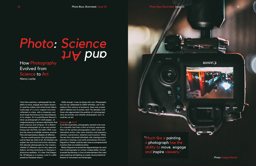
One of my first experiments with typesetting in a commercial sense. The purpose was to create a spread for a mock magazine in two different ways. This first way can be considered a more traditional approach. I played with colors and flipping the image and type, but kept it conservative. Since the article was about photography’s role in art, I represent it in an artistic way. The red color in the type and the black background both come from the image and gives it a natural look while still being pleasing to the eye and standing out just enough.
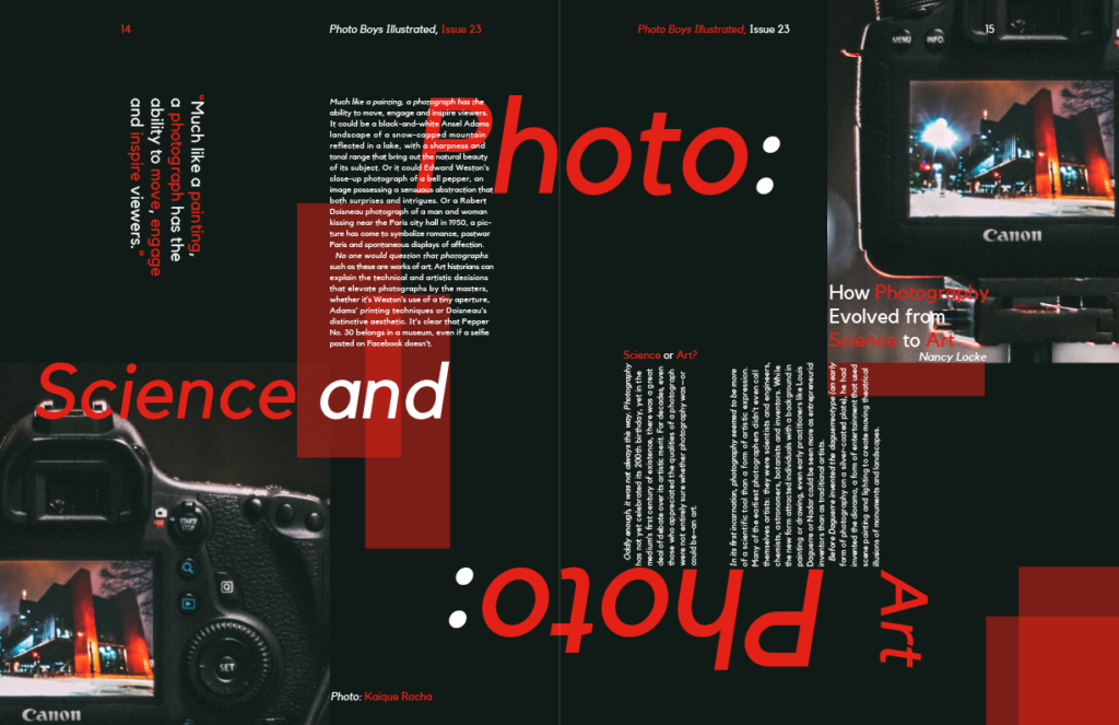
The second version I pushed what I played with in the first version to create and even more artistic and visually appealing image. This time I added repetition and additional geometry that comes from the rectangular shape of the camera. Hierarchy was considered greatly when making this other version that looked crazy on the surface, but still read in the same order. In order to read it, the viewer needs to exhibit a similar playfulness to how I put it together. They need to turn it around different directions to get the whole story, but nothing is lost.
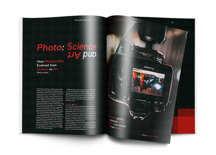
While my personal favorite is the more traditional spread, the second version is more visually interesting. I personally prefer things to be clean and organized, but I understand that sticking too much to one thing can be bad. I am happy with both versions.
