
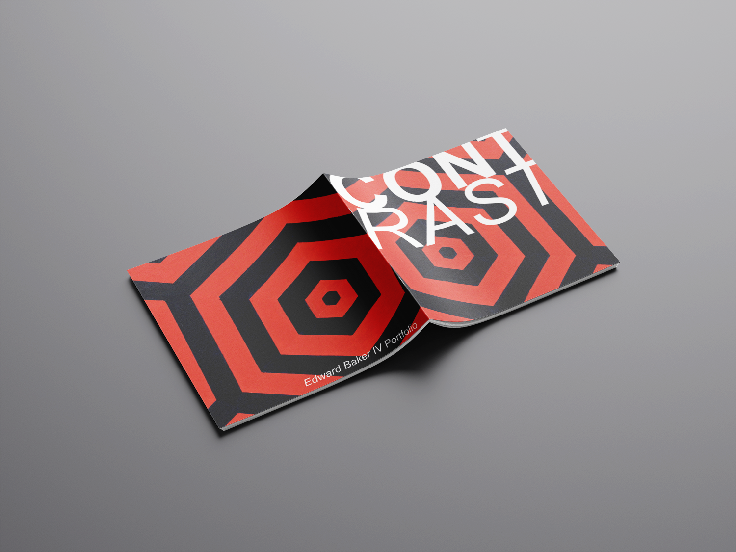
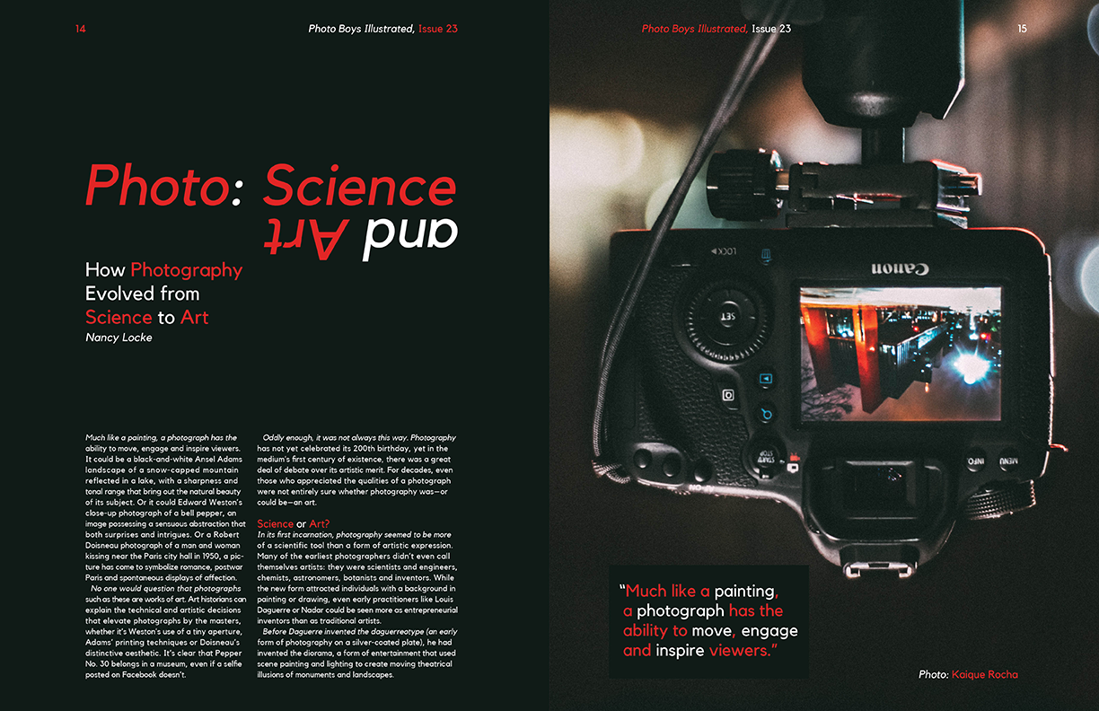
My portfolio is named Contrast because of the way I tend to play with extreme contrasts to create my work. Another aspect that is heavily featured is the hexagon. This relates to my love of geometry and the hexagon that has slowly become my signature. I have grown to love experimenting with contrast and using it to create dynamic images with clear lines and large ranges of tones and colors.
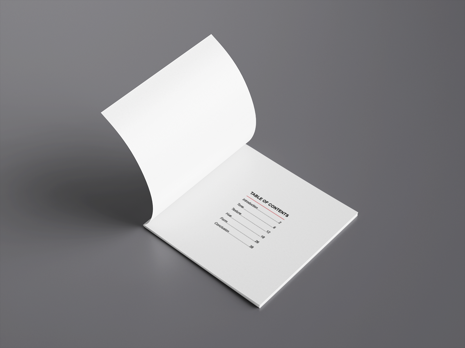
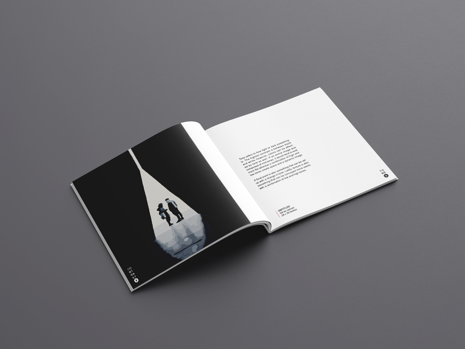
The portfolio also doubles as a book that teaches about contrast and the various aspects that can be utilized. Tone, texture, hue, and form are the four main topics covered. The range of works featured include graphic design, painting, photography, and printmaking. The main focus of the book are the pictures, therefore they are large and in charge! Them, along with the type layout, are arranged in a modular grid fashion to play on the geometry featured and with the square shape of the portfolio itself.
The text layout is simple and the font is sans-serif in order to give off a sense of minimalism and elegance. This is also done so that it does not distract the reader from the main content of the images.
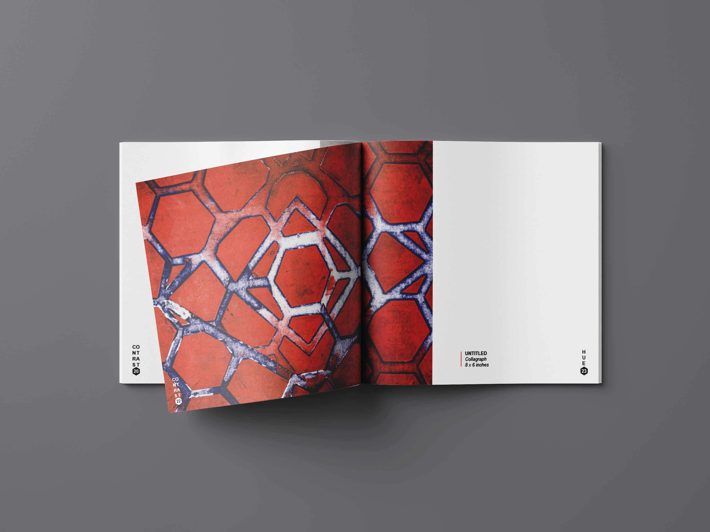
The geometry even plays a role in the page numbers and chapters. This adds some more style and visual appeal while relating to the book. They relate so well and perfectly sized that they are noticeable, but not distracting. A nice touch indeed!

