
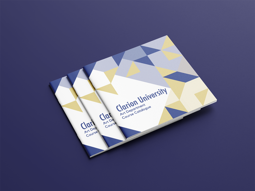
This booklet is a mock course catalog for the art program at Clarion University, the college that I graduated from. Included are all of the staff, degrees, and art courses offered at the university. There was a page limit that it could be and only the cover could be in color. I chose a square booklet shape because I knew it could easily and evenly lend itself to some interesting designs using geometry. The university’s colors are blue and gold. I reflected this in the front and back covers.
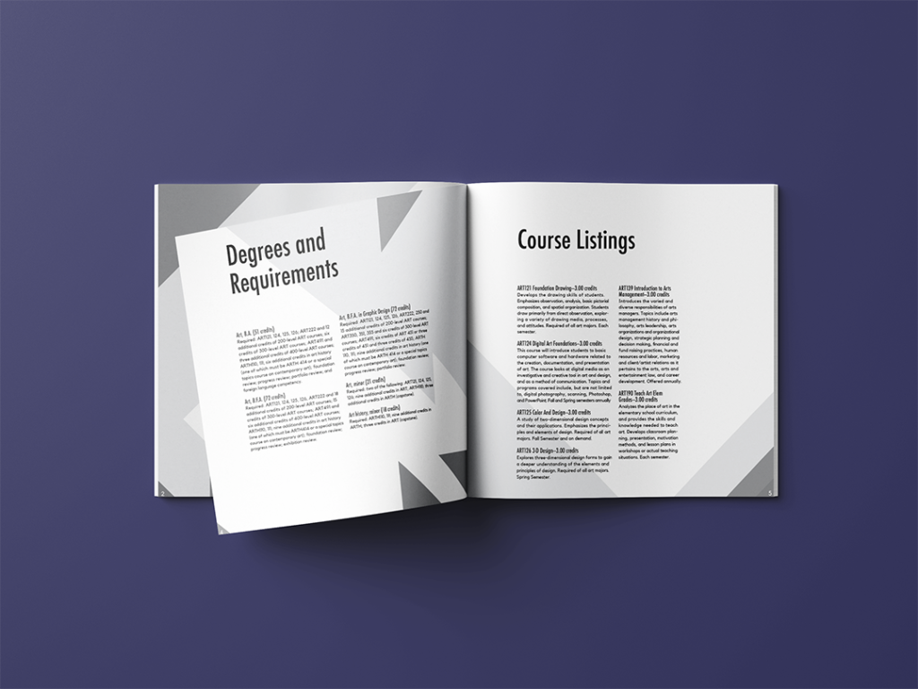
The layering of the geometry makes for interesting combinations and designs that give the booklet more dimension. The covers are made to look more illustrative by making the dark triangles darker than on the inside. This is because the cover is meant to catch the eye, while the inside is meant to be read. I want the geometry to look natural and not be distracting to those reading.
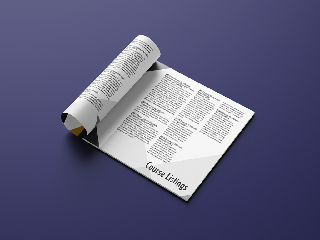
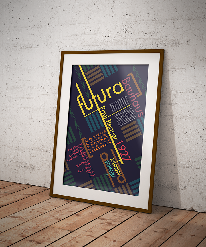
The text is laid out in a modular style to coincide with the geometry that is placed on a grid. This relates the text and background elements to make an overall more cohesive piece. Lastly, I chose the Futura font because it is sans-serif and modern while also relating to the geometry even more. Futura was inspired by Bauhaus aesthetic and focuses on using shapes to build the letters.

